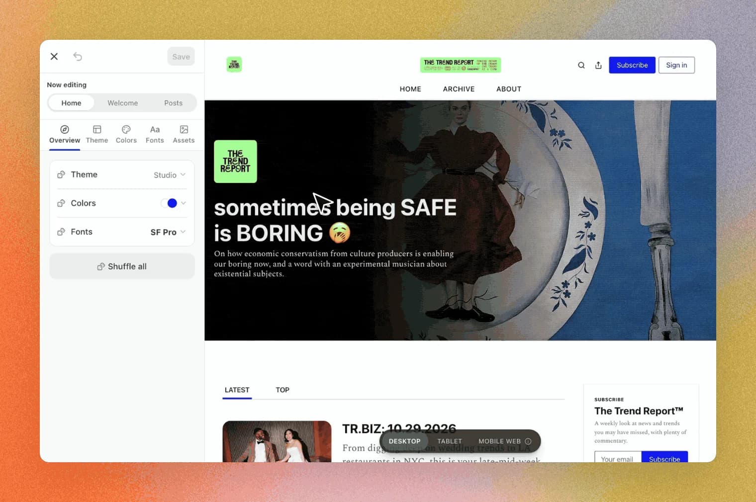
Today we’re launching new website design tools that give you more control over how your Substack looks and feels.
You shouldn’t have to choose between a site that feels like yours and a place that helps you grow, with the recommendations, the app, and Notes that bring new subscribers to you. These new design tools are built on that idea. As Substack’s head of design, Mills Baker, puts it, Substack is “another bite at the apple,” a chance to take the best of the internet’s past and present, recombine them, and see if they yield something better. In short, Substack is your corner of the internet, and we are building more ways for you to make it look and feel like your own.
The updated website editor comes loaded with seven themes to use as a jumping-off point. Within them live a wide range of combinations that make it easy to land on a site that feels like you.
Play in the Mini-Editor: Straight from your publication homepage, you can open a quick-access editor in the bottom-right corner to play with layouts, color palettes, and fonts. Click the dice icon next to any option to randomize it, or hit “Shuffle all” to cycle through combinations fast.
Fine-tune in the Full Editor: The Full Editor lets you shape the look of your Home page, Welcome page, and Post pages. Pick a theme, then adjust your header, hero section, main body, and footer. Choose from suggested color palettes or set your own with the new color picker. Set typefaces for your wordmark, post titles, section titles, and body text. Add a logo or a wordmark image and resize it until it looks just right. Use the preview to see how your site will look on desktop, tablet, and mobile web. (The Substack app has its own layout, so your changes will not appear there.) Your new design won’t go live until you hit save, so feel free to explore at your own pace.
Learn more about customizing your site in our Help Center.
Learn more about customizing your site in our Help Center.
These new tools are the first in a series of improvements we’ll be making in the coming months to give you more control over your site. The goal is to help you take your design to the next level easily and quickly, without sacrificing the network and growth effects that enable your work to find new audiences.
We gave a few publishers early access to the new tools. Here’s how they made their sites their own, along with their tips for getting started:
Kyle Raymond Fitzpatrick writes The Trend Report™, a weekly newsletter his readers treat like a Sunday paper. “They’re like, ‘I wake up, I read the Trend Report, and I drink coffee,’” Kyle says. That became the brief for the redesign.
His partner in life and business, Bobby Solomon, a longtime designer by trade, does all the design work for the publication. “If your writing is really vibrant but maybe the vessel with which it shows up isn’t vibrant, it can feel a little flat,” Bobby says. They chose the Cinematic theme, which felt closer to the editorial front page of a Sunday paper. Kyle pins the main trend report of the week, so readers land on one striking image that sets the tone and points them to the top story.
The whole redesign was quick, including a few minutes experimenting with “Shuffle all.” “It definitely taught me what the publication maybe shouldn’t look like,” Kyle says, “which is its own kind of useful.”
Their advice for anyone starting out:
- Check legibility when you choose colors, because it’s all about the writing.
Check legibility when you choose colors, because it’s all about the writing.
- Then, be bold. “A lot of people are writing right now,” Bobby says, “so what makes you unique?” Consider going a little over the top.
Then, be bold. “A lot of people are writing right now,” Bobby says, “so what makes you unique?” Consider going a little over the top.
- Let your theme guide everything else. Think about how your images, flourishes, and tone can carry from your site into people’s inboxes.
Let your theme guide everything else. Think about how your images, flourishes, and tone can carry from your site into people’s inboxes.
Narratively, the independent storytelling company that has commissioned and published thousands of writers’ true stories, also opted for a bold redesign of their site using the Cinematic theme as a starting point. Pink text against a dark background and large feature blocks give the publication’s longform narratives plenty of room to stand out. The team updated their companion publication, Narratively Academy, a writer community and education hub, too. For a magazine that has always been “story-first and writer-first,” the new layouts feel “far more visually arresting and true to our brand,” says co-founder Noah Rosenberg. “It took less than 10 minutes to get new designs up for both our sites.”
His advice? “Experiment early and often! A couple of years ago, a design change might have meant a team meeting and a pile of saved drafts.” This time, “our latest design was live faster than it would have taken to schedule that meeting.”
Arden Yum writes Ad Hoc, a publication about culture, identity, and the aesthetics of everyday life, with essays on everything from matcha to ceramics and a series that collects the routines of people she admires. Mia Brabham Nolan writes In Deep With Mia Brabham Nolan, her “deep end” of entertainment and pop culture, alongside The Saturday Letter, a more personal newsletter on life, motherhood, and creativity in New York.
Both updated their sites with new colors, fonts, and content block styles, then used the Full Editor to fine-tune details like the wordmark and navigation bar. Mia also added a delightful custom cursor through her website settings that carries her branding through to the smallest detail.
For Arden, the process felt like a return to an old passion:
“I was obsessed with making websites as a teenager. The new tools feel a lot like those days of tinkering with HTML and CSS, adjusting layouts, picking colors with a dropper, and combing through fonts until I found the perfect one, but this time, I only spent an hour updating Ad Hoc’s site, thanks to the lovely, no-code editor.”
“I was obsessed with making websites as a teenager. The new tools feel a lot like those days of tinkering with HTML and CSS, adjusting layouts, picking colors with a dropper, and combing through fonts until I found the perfect one, but this time, I only spent an hour updating Ad Hoc’s site, thanks to the lovely, no-code editor.”
She wants Ad Hoc to be a place where language turns everyday observations into ideas that feel “expansive, rigorous, and beautiful,” so she balances playful motifs like hand-drawn stars with more traditional serif fonts—“shoutout Libre Baskerville.”
Her advice to other publishers is to experiment, have fun, and trust your intuition. “Pay attention to what you like in the wild, and see if you can apply the same principles to your own design.” As for the most underrated Substack feature? Colorful text. “If I mention a sapphire necklace, or a creamy matcha latte, I can make the words blue and green. Marrying the visual and semantic in this way lights up my brain.”
If you like the overall look of your site and just want to iterate on the small stuff, from fonts to wordmark size, you can do that, and add a header image too. FOUND, a city guide with recommendations and intel on where to eat, drink, stay, and shop, brought its city editions under one umbrella last month with a single paid subscription unlocking everything it publishes.
It kept the tried-and-true Classic Substack theme and used the new header image to put its brand front and center—all while keeping a distinct colorway and author profile for each city, from New York to Paris. “The goal of the design is to allow readers to engage on multiple levels,” say the team, “as locals who want to get more out of the place they live, travelers looking for something beyond the generic lists clogging their feeds, or cosmopolitan explorers in search of new frontiers.”
Try it out, then let us know how it went. Restack this post with your feedback, and share your new look in Notes. We’re always reading and are excited to see what you make.