Before Jess Xuan was designing for some of the world’s most recognizable brands, she was a kid on Neopets learning her first line of code. That early curiosity, paired with a fascination with the internet’s DIY, open-source spirit, set her on a path from teaching herself Photoshop tricks to a decade-plus career.
Jess is a graphic and digital designer at Squarespace, originally from Melbourne, Australia, who has worked in the cultural and commercial sectors. Previously at Work & Co and Bureau for Visual Affairs, she’s helped the likes of Loewe, Commonwealth Bank, and It’s Nice That define and recreate their digital presences. Her designs make the internet a little more whimsical and a lot more accessible.
We asked her 10 questions about websites in history that shaped her, including an “anti-user friendly” artist project that challenged her thinking and a government website redesign she still points to as a model.
Growing up online and discovering design
What websites do you remember spending a lot of time on as a kid?
I spent a lot of time on the internet growing up. I have very fond memories of doing my Neopets dailies and interacting with the adjacent pixel art community. I still remember learning the code for links (using the <a> tag) from a Neopets custom site and teaching my best friend in primary school. A few of the old pixel art community members recently reconnected, and it's amusing how many of us ended up in the creative industries, and especially how many are fellow product designers.
I also loved how the internet valued open-source learning. There were accessible, free tutorials and step-by-step guides on how to code and use Photoshop. I learned so many of my Photoshop tricks from old LiveJournal tutorials that can't be found anymore. Later in my teens, I gravitated toward logo and branding blogs. I really loved Tumblr and FFFFOUND! for finding inspiration, and Awwwards for its showcase of innovative web design at the time.
What got you interested in design in the first place?
I’ve always loved design. My weekend Chinese classes in primary school had me making books, which I enjoyed, and I designed a (pretty bad) board game as a preteen. As I got older, I really loved the cleverness of branding logos (think the hidden arrow in the FedEx logo) and minimal and fun packaging. I spent hours on websites like The Dieline and BP&O. The work of Miles Newlyn really inspired me then too.
In eighth grade I wrote that I wanted to be a graphic designer when I grew up. My time at university studying it only solidified this. As I got older I grew less interested in branding and more inclined towards digital design. Embarrassingly, graphic design is truly just my passion.
What shaped her design philosophy
Looking across the websites you’ve named, what specific design choices have found their way into your own work?
Something I really loved about the early-2000s internet was the feeling of whimsy and wonder. Everything felt exciting and possible. I try to emulate that feeling whenever I can—it's tricky to balance good design with the right mix of function and playfulness. And because I've used so many websites, I naturally want them to have a good user experience with intuitive patterns. I don't want to add barriers to information or make things needlessly complex. I try to make websites as universally accessible as possible and bring people joy. When I redesigned It’s Nice That in 2019, I tried to convey that best through bright colors, clear typographic hierarchy and ample white space.
An artist I see as maybe on the opposite end of the functional spectrum is Yehwan Song, who I heard speak years ago. I really loved their approach to making art—often creating deliberately inaccessible websites intended to be anti-user friendly in order to push boundaries and make you reconsider the conformity and purpose of modern web design. Their approach to using the web as a medium for examining power is really interesting.
Is there an older website whose influence you still see in web design?
In 2016, I remember hearing a talk at POST design festival about the recently revamped gov.uk website done internally by the Government Digital Service team. It was an ambitious project that tried to make UK government websites more accessible and understandable to the public, using simple principles like ‘plain English’, user-centered navigation flows, and a clear design library. Since the momentous redesign—which I’ve appreciatively used—I've noticed many government websites attempting to follow similar visual cues, flows, and principles.
Also, despite all my best efforts to decolonize my aesthetic preferences, I really am a sucker for Swiss European modernism, which I consider timeless in design and still pretty ubiquitous.
What are some other websites that you think are well designed today?
I really loved read.cv before it shut down—the aesthetic and overall feeling was so simple and clean. It’s not an easy feat to make resumes beautiful (they are often too cluttered) and I loved that they achieved that mission.
From a functional perspective, I also really love Mobbin, a repository of web and app design reference screens. The taxonomy and search functionality work really well and everything feels intuitive since it’s made by designers, for designers. It’s also taught me some newer terminology like ‘coach marks’ in their element listing!
I remember finding the This American Life website very intuitive to use too. From a visual perspective, a few sites I really love are Foam, early era Kinfolk and designer Luke Hoban’s portfolio. Special shoutout to The Pudding for their innovative editorial design.
Building a well-designed website
Did you ever build a website for yourself or a friend? What do you remember about it?
I took a SuperHi course to learn coding for designers, alongside a coding unit in university. I worked on a website (The Boy Club) for some friends. It was a lot of trial and error and it was an interesting learning experience I definitely don’t want to recreate! I’m much happier as a designer and love to leave development to the experts. Of course, nowadays, you can just use AI to spin up a website and connect it to a CMS, which makes the possibilities infinitely more fun and exciting.
If I’m starting to build a website, what are some good tips to keep in mind?
- Have a clear purpose for your website and tell people how to contact you. Don’t make it hard for people to find the information they are looking for.
Have a clear purpose for your website and tell people how to contact you. Don’t make it hard for people to find the information they are looking for.
- Don’t use more than three fonts. Ideally you’re using one or two. Make sure there is enough color contrast between the background and the text so it's legible.
Don’t use more than three fonts. Ideally you’re using one or two. Make sure there is enough color contrast between the background and the text so it's legible.
- Don’t be afraid of white space. A lot of people think that every inch of space should be used on the screen, but having some white space helps alleviate some of the cognitive load when scrolling through websites.
Don’t be afraid of white space. A lot of people think that every inch of space should be used on the screen, but having some white space helps alleviate some of the cognitive load when scrolling through websites.
- Stick to a consistent grid whenever possible (though this might just be my Eurocentric bias).
Stick to a consistent grid whenever possible (though this might just be my Eurocentric bias).
- Make sure your personality comes through. Don’t make your website look like every other website out there! Writing style and imagery go a long way in making your website feel unique. Ask a friend if the website feels like ‘you’ enough.
Make sure your personality comes through. Don’t make your website look like every other website out there! Writing style and imagery go a long way in making your website feel unique. Ask a friend if the website feels like ‘you’ enough.
You design websites at Squarespace. Why is design so central to the company’s approach to websites?
One of Squarespace's values is 'Design is not a luxury', which I really agree with—good design should be accessible to everyone. It’s something that isn’t always valued or understood, but good design isn’t just visually pleasing for the sake of it—it’s vital to any experience.
Considered and well-executed design creates better user experiences which translate directly to better business outcomes. Large typography is easier to read. Clear and plain copy makes information easy to digest. We’ve all had experiences of good and poor design, and companies that value good design tend to do best. It’s a win-win for anyone wanting to create a website and their user base.
On designing with AI and what’s next
AI tools promise to make design accessible to more people. What role should AI play in the design process?
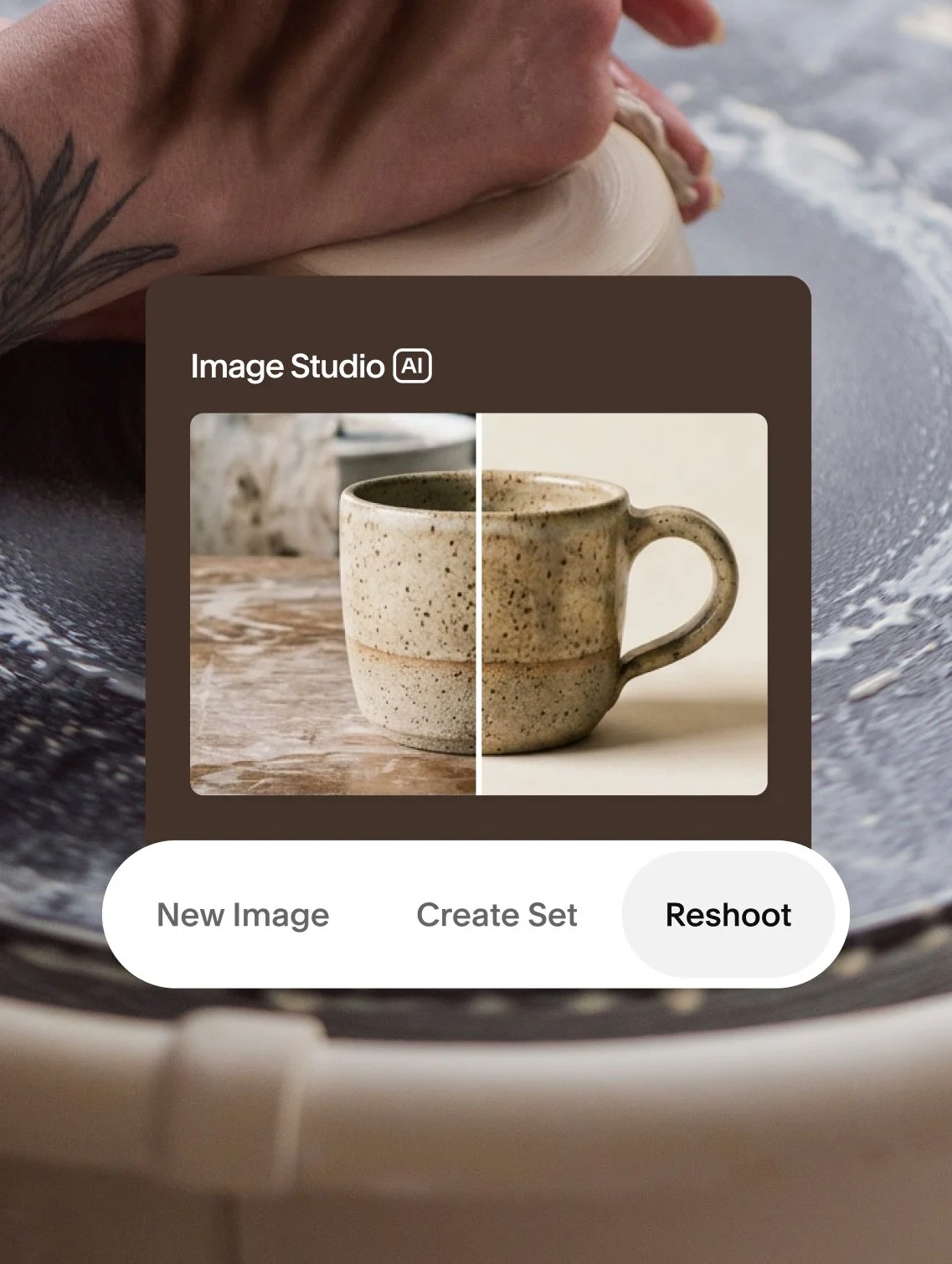
Squarespace is in an exciting era of experimenting with how AI can be used in our workflows. Using tools like Claude and Cursor to aid things ranging from a sparring partner for concepting to fully automating menial tasks like creating spreadsheets. It’s been really helpful in clearing time to do the real work—actually designing.
It feels like AI will never fully replace humans, it’s just another tool to make our work better. I think of it like the onset of smartphones. A lot of people had the same valid criticisms (ethical electricity consumption, societal cognitive doomerism) but in the end, smartphones are ubiquitous and extremely helpful for many of us. Rather than fighting AI directly, it’d be better if we could come up with creative ways we can use it as ethically as possible and make our work even better.
Any design projects that you have kicking around outside of Squarespace?
I’ve had a few projects in mind for years but I spend a lot of my free time outside of work not doing design! In most countries I’ve lived in, I’ve been involved in grassroots organizing for marginalized identities. I also recently accidentally fell into competitive esports when I was living in Denmark. Nowadays I’m just focusing on doing my best design work on the job.